Monday, June 25, 2018

Paintings from Teaching

I have been teaching at Chesapeake Fine Art Studio in Kent Island. Here are a few paintings from the classes I taught.


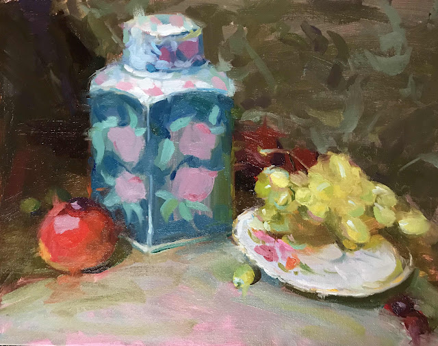
Oriental Jar and Grapes, 11 x 14

This painting was done to show students a split complementary color scheme, which in this case is red with blue-green and yellow-green.


Copper Pot and Apples, 11 x 14

After a class on strong Notan designs and brushstrokes, I painted the same setup with the students during the open studio.


Peonies, Tangerine and Pear, 11 x 14

This is done after my classes to practice what I preach: Direct the eye to the focus of the painting using the brightest color, the sharpest edge, and the strongest contrast. 

Friday, March 16, 2018

Painting from Photos

It has been a point of contention among artists for years: Is it a sin to paint from photos instead of painting from life, especially when the photos are not taken by yourself? The painting below are all done from photos I found online. I became tired of model sessions with harsh lighting and uninspiring outfits. So I experimented with different photos of Asian, Caucasian, olive-skinned, and African-American models. I think I learned from the experience. And the best part? I practiced painting different skin tones. 

What I learned: Simplify values, colors and shapes. Do not paint everything you see. Focus on where the light and shadow meets -- that’s where the most interesting drawing takes place and where local colors make an appearance. It helps to premix a few colors for the major shapes in your painting. Additionally, more nuanced colors can be achieved when mixing with a palette knife.