Friday, May 31, 2019

Demos and Studies

Here are some recent demos from the classes I taught and some studies from the open studio.


Tools of the Trade, 11 x 14


Italian Bow Tie Pasta, 10 x 8


The Violin, 10 x 8


Red Apples, 11x14


Flowers in the Sun, 10 x 8


Colored Glass on a Windowsill, 6 x 8

Monday, June 25, 2018

Paintings from Teaching

I have been teaching at Chesapeake Fine Art Studio in Kent Island. Here are a few paintings from the classes I taught.


Oriental Jar and Grapes, 11 x 14

This painting was done to show students a split complementary color scheme, which in this case is red with blue-green and yellow-green.


Copper Pot and Apples, 11 x 14

After a class on strong Notan designs and brushstrokes, I painted the same setup with the students during the open studio.


Peonies, Tangerine and Pear, 11 x 14

This is done after my classes to practice what I preach: Direct the eye to the focus of the painting using the brightest color, the sharpest edge, and the strongest contrast. 

Friday, March 16, 2018

Painting from Photos

It has been a point of contention among artists for years: Is it a sin to paint from photos instead of painting from life, especially when the photos are not taken by yourself? The painting below are all done from photos I found online. I became tired of model sessions with harsh lighting and uninspiring outfits. So I experimented with different photos of Asian, Caucasian, olive-skinned, and African-American models. I think I learned from the experience. And the best part? I practiced painting different skin tones. 

What I learned: Simplify values, colors and shapes. Do not paint everything you see. Focus on where the light and shadow meets -- that’s where the most interesting drawing takes place and where local colors make an appearance. It helps to premix a few colors for the major shapes in your painting. Additionally, more nuanced colors can be achieved when mixing with a palette knife.


Tuesday, August 8, 2017

Summer Flowers


Oil on linen panel, 11 x 14

These flowers are from a local fruit stand. I love how organic and unique they look with an explosion of colors and forms, unlike the typical bouquets you find in grocery stores and flower shops. 

I remember the great artist, Quang Ho, said in his still-life painting video that the best still-life has a sense of randomness in it, as if you happen to find the objects in their current state. It does not look staged or forced. To achieve the unfussed look, you can experiment and put different things together, and see how they look. You might spend hours arranging it, yet it looks beautiful and effortless in a haphazard way.

These flowers are a testament to this philosophy. They fell into a graceful arrangement once I put them in a tall vase, bursting with colors and energy. I didn't need to arrange them too much. I truly slowed down for this painting. Usually, I paint flowers fast, carried by the initial excitement and the urgency that the flowers could soon wither and change their shapes. But this time I was drawn to study each flower closely to see its structure and character. There is clarity and satisfaction in observing those details carefully. 

That light green flower on the left took me over three hours to paint. Then I scraped it and started over the next day. It was an absorbing and engrossing experience. What I learned was -- if I stare at the flower long enough, I can actually paint its every petal and come to a better understanding of the light and shadow pattern on the flower. What's more, the silhouette of each flower is super important in revealing its distinct character.

Thursday, May 11, 2017

Joshua Been Lecture and Demo

I attended a Joshua Been lecture and demo last Saturday at my friend Hai-ou Hou's place, Chesapeake Fine Art Studio. It was fantastic. He has it down to a science from figuring out a myriad of plein air gear to his approach to plein air painting. His method is very disciplined, which I lack, that includes always doing a pre-sketch with four value markers before starting to paint. This neat little pack is what he uses to make black-and-white sketches. You can buy it on his website.


The pen with a little white sphere on top is what he uses to determine the precise direction of the light source. 

He breaks down the visual language into four elements: values, shapes, edges and texture. The values are the foundation and you lay it down by doing pre-sketches. I use this method sometimes and make a thumb-nail sketch before painting. But it's usually for my studio paintings or for figuring out a composition for my ideas. When it comes to plein air painting, I feel an urgency because the light changes so fast, so I tend to jump right in. If the first composition doesn't work out, I'll just wipe it out and redraw it. That tones my canvas too. In a way, I like the chaos, the not-knowing, and the unpredictable nature of the process. My friend Janice has been doing these sketches. They do help make sure your painting come out better. Maybe I should start making them now!


This is his palette on the day-tripper easel he designed and sells on his website. Janice already bought one. It's very lightweight. He only uses seven colors: titanium white, lemon yellow(missing?), cadmium yellow medium, cadmium orange, burnt sienna, cerulean blue hue, alizarin crimson, and ultramarine blue. No black. He starts the painting thick, no thinned washes.


This compact little thing is his fly-on-the-wall easel. It's good for painting in tight spaces where you really don't want to cause a scene. He used this to paint the dinosaurs in the Smithonian museum in DC. I like his dinosaur paintings.


And this little sunset(sunrise?) painting.


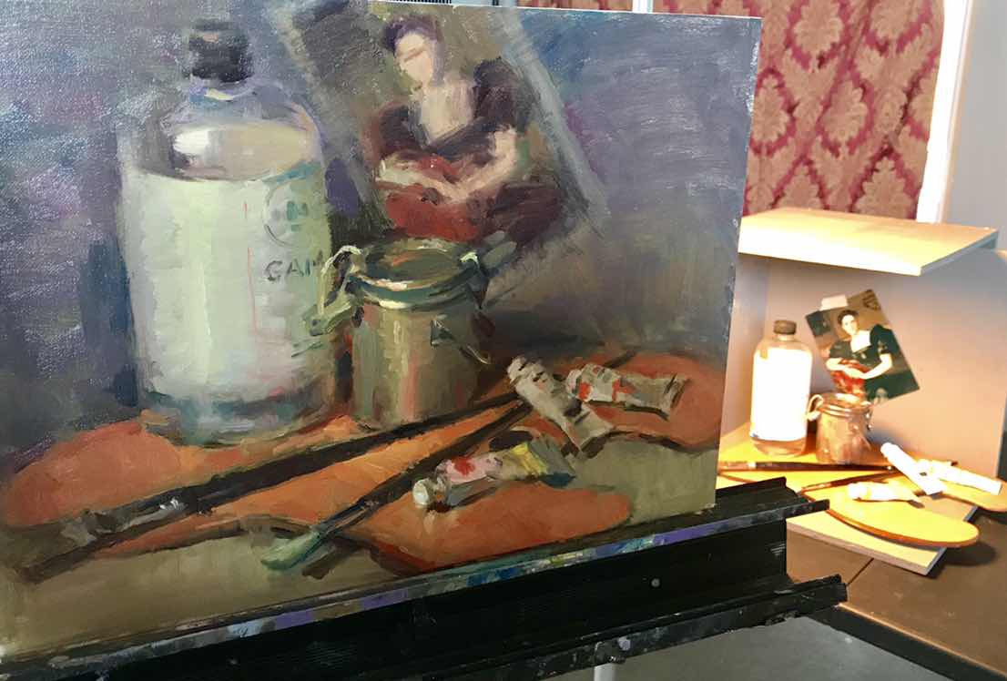
Then he did a demo, a larger piece from a smaller study. 


He's a great plein air artist, and articulated his methods clearly. I bought his book. It will come in the mail. Now the thing for me to do is go out there and practice it myself!

Tuesday, May 9, 2017

Outdoor Figure Painting

Oil on linen panel, 12 x 16

This is my first ever outdoor figure painting. Can you believe it?! I painted this with my artist friend Abigail on my deck. Abigail has a lot of experience painting outdoor figures since she studied with John Ebersberger and at the Cape Cod School of Art. She's done many mud heads, figures on the beach, etc. She couldn't believe I had never painted a figure outdoors. But it's true. Somehow all my portraits and figures were done indoor with controlled lighting. But I'm liking the outdoor light with the cool reflected light on the model's face.

It was a cloudy day and made for an interesting study of the colors on the model's skin and kimono. But the sun kept going in and out of the clouds, making painting more difficult. It's a complete different painting when the sun came out! 

Kuniko is a wonderful model. She always arrives early, times herself, and holds the pose steadily. We are happy to have her working with us.

Thursday, May 4, 2017

Azalea Garden


The weather is getting warmer and better for plein air painting. My artist friend Janice told me about this pretty azalea garden in Clarksville and I painted with her there a couple of times in the past two weeks. There are tons of azaleas in different colors -- white, pink, fuchsia, and violet. They peaked last week and are going away now. But what a beautiful sight when they are all blooming by the water!